

Xintra – React JavaScript React-Bootstrap Admin & Dashboard Template
Xintra – React JavaScript React-Bootstrap Admin & Dashboard Template, With these template formats, it's very easy to create a presence and grab someone's attention around the web page Because the template is built using React, CSS3, React-Bootstrap framework and with Sass. So please before you start working with the template take a quick look on the documentation so that you can easily built your website.
If You Love Our Template Design Please don't forgot to rate it. Thank you so much! 😊
Dashboard
Welcome to Xintra - React JavaScript React-Bootstrap Admin & Dashboard Template- Created Date : 24/Jan/2024
- Author : Spruko
- Company : Spruko Technologies Private Limited
Thank you for showing interest towards our admin template. Feel free to contact us any time. We have a dedicated team to provide you the best support. If you want any queries open support ticket https://support.spruko.com.
Xintra is a React JavaScript React-Bootstrap Admin Template using modern and minimal design. It is fully flexible user-friendly and responsive. Xintra Modern template is powered with React Pages, SASS, & React-Bootstrap which looks great on Desktops, Tablets, and Mobile Devices. This Template Includes 180+ React Pages . No Need to do hard work for this template customization. We already designed it and you can easily design your website just how you like it. This template using React-Bootstrap framework. After Purchased this template you will get All Jsx files,CSS, Scss and JSX Files.
It has super clean flat user interface admin design, easy customizable components and widgets.The Template comes with a awesome unique design also we ensure you can easily design template.
It is a fully responsive layout for all type of devices. Works on all major web browsers, Desktop, iPhone, iPad, Tablet and all other smart phone devices
Once you Purchase Xintra React JavaScript React-Bootstrap Admin Template, you will be able to get free download of all future updates.
- Firefox
- Safari
- Opera
- Chrome
- Edge
Theme Styles
- Light & Dark Themes
- LTR & RTL
- Vertical & Horizontal Navigation Styles
- Menu Click & Hover Styles
- Icon Click & Hover Styles
- Page Regular, Classic & Modern Styles
- Full Width & Boxed
- Menu Fixed & Scrollable
- Header Fixed & Scrollable
- Sidemenu Closed
- Icon Text Menu
- Icon Overlay
- Detached
- Double Menu
Theme Colors
- Menu Light
- Menu Dark
- Menu Color
- Menu Gradient
- Menu Transparent
- Header Light
- Header Dark
- Header Color
- Header Gradient
- Header Transparent
- Theme Primary
- Theme Background
- Menu With Background Images
| No Jquery | Dark Layout | RTL Ready |
| Icons | Authentication Pages | Error Pages |
| 180+ React Pages | Easy to Customize | React-Bootstrap Responsive Framework |
| Form Elements | Maps | Ratings |
| Form Advanced | Form wizards | Profile Settings |
| Grid JS Tables | Data Tables | Gallery |
| Apex Charts | Chartjs Charts | Echarts |
| Full Calendar | Sweet Alerts | Swiper JS |
| Blog Pages | Mail App | Chat |
| File Manager | Invoice | Landing Page |
| Pricing | Profile | Placeholders |
| Ecommerce Pages | Job Pages | Task Pages |
| NFT Pages | CRM Pages | Crypto Pages |
| Form Validation | Sortable Js | Tour |
| 24 * 7 Professional Company Support | Media Player | Under Construction Page |
| Color Theme Support (Primary and Background) | Neat, clean and simple design | W3C Validated |
Introduction to the React + vite
Welcome to React...
React is a powerful application design framework and development platform that enables you to create highly efficient and sophisticated single-page applications. With React, you can build modern applications for the desktop, web, and mobile devices, using the latest web development technologies and tools. This framework is known for its ability to create responsive, dynamic, and engaging user interfaces that provide an optimal user experience across all devices. Whether you're building a simple web app or a complex enterprise-level application, React provides the tools and flexibility you need to create high-quality, scalable, and maintainable applications.
Welcome to vite..
Vite is a cutting-edge build tool that is designed to streamline and optimize the development experience for modern web projects. It is built with a focus on speed and efficiency, and it offers a leaner development experience than traditional build tools. With Vite, you can enjoy a faster and more fluid development process, as it provides an instant server start-up, lightning-fast hot module replacement, and seamless development-time asset serving. This tool is particularly useful for building modern web applications that require a fast and responsive user interface, as it can significantly reduce development time and increase productivity. Overall, Vite is a powerful and flexible build tool that is well-suited for modern web development workflows.
Getting Started
Setting Up The Local Environment & Workspace
This comprehensive guide provides step-by-step instructions on how to set up your development environment React tool. It covers everything from the necessary prerequisites to installing the tool, creating an initial workspace, and setting up a starter app. You'll also learn how to run the app locally to test and verify your setup. By following this guide, you can ensure that your development environment is properly configured for React, and you can get started with your project confidently and efficiently. Whether you're a beginner or an experienced developer, this guide is an essential resource for anyone looking to work with React.
To get started with a React application, there are three prerequisites that you need to have in place.
Prerequisites
To use the React JavaScript Framework, you should be familiar with the following:- React
- React Bootstrap
- JavaScript
Creating a Component
The easiest way to create a component is with the React CLI. You can also create a component manually.
Creating a component using the React CLI
To create a component using the React CLI:
- From a terminal window, navigate to the directory containing your application
- Run the
generate-react-cli component <component-name>command, where<component-name>is the name of your new component.
generate-react-cli component <component-name>- A folder named after the component
- A component file,
<component-name>.component - A template file,
<component-name>.component.jsx - A CSS file,
<component-name>.component.css - A testing specification file,
<component-name>.component.spec.ts
<component-name> is the name of your component.
Vite Installation Setup
Create a workspace and initial application
You develop apps in the context of an vite-React workspace.
To create a new workspace and initial starter app just follow the below
steps
- Run the command , as shown below
- This new command prompts for the information about features to include in the initial app. Accept the defaults by pressing the Enter or Return key. 2.Second step: provide your project name as my-app
1.First step :
npm create vite@latest
Project name : my-app
3.Third step:
select your required framework you are familiar with,
Select a framework: React
4.Fourth step:
select your required script language you are familiar with,
Select a language: JavaScript
The vite installs the necessary React npm packages and other dependencies. This can take a few minutes. This creates a new workspaces and
a simple Welcome app, ready to run.
Run the application
The vite includes a server, so that you can build and serve your app locally.
- Navigate to the workspace folder, such as my-app.
- Run the following commands:
                      cd my-app
 npm run dev
The yarn or npm serve command launches the server, watches your files, and
rebuilds the
app as you make changes to those files.
The run dev just Option automatically opens your default
browser to http://localhost:5173/.
Xintra Setup
If you have already download and install node.js and React then ignore prerequisites.
Prerequisites
Node.js
Download latest version of node.js from
nodejs.org.
Install Node.js using downloaded file.
To check your node version, run node -v in a terminal/console window (cmd)
React
To install the React using npm, open a terminal/console window and run the following command.
                      npm install react
                      (or)
                      yarn install react
Setup an Xintra Template by
- Download the Xintra rar/zip file.
- Extract it and then go in to Folder here you will see a Xintra Folders
- For Example
- Here, I'm Choosing vite-file.
- Now from a terminal window, navigate to the directory containing your application
- You can import all dependency by installing npm command
- Now you are in stage to successfully run Xintra using below command:
Xintra/vite-file>
                      npm install
                      (or)
                      yarn install
                      npm run dev
                      (or)
                      yarn run dev
Once you serve your application by default it will take their default port
using
http://localhost:5173/
Note
npm installIf your are using npm install, You have to delete the
yarn-lock file(or)
yarn installIf your are using yarn install, You have to delete the
package-lock.json filebasically npm i is used to install all dependencies or devDependencies from a package. if there will be any dependencies which need to be installed but getting error message while installing, then --force will help to install those dependencies.
The --force argument will force npm to fetch remote resources even if a local copy exists on disk. It will be on a last-dependency-downloaded-wins basis and will overwrite any previously downloaded dependencies.
npm install --forceit will always skip peer dependencies (whatever those are) during installation even if there are no issues.
npm install--legacy-peer-depswe have to use only one file example: (for yarn yarn-lock) & (for npm package-lock.json) file
Build Application
Build your application for host on server using below command:
                      yarn run build
                      (or)
                      npm run build
Installation Video
                    src/
						├── assets/
						├── |-- audio/
						├── |-- css/
						|   |-- |-- global/
						|   |-- |-- icons.css/
						|   |-- |--icons.css.map/
						|   |-- |-- styles.css
						|   |-- |-- styles.min.css.map
						|   |-- |-- variables.css
						|   |-- |-- styles.min.css.map
						├── |-- icon-fonts/
						|   |-- |-- bootstrap-icons/
						|   |-- |-- boxicons/
						|   |-- |-- feather/
						|   |-- |-- line-awesome/
						|   |-- |-- Remixicons/
						|   |-- |-- tabler-icons/
						├── |-- images/
						├── |-- scss/
						|   |-- |-- bootstrap/
						|   |-- |-- custom/
						|   |-- |-- global/
						|   |-- |-- menu-styles/
						|   |-- |-- pages/
						|   |-- |-- util/
						|   |-- |--_bootstrap.scss/
						|   |-- |-- _switcher.scss
						|   |-- |-- _variables.scss
						|   |-- |-- icons.scss
						|   |-- |-- styles.scss
						├── |-- video/
						|   |-- components/
						|   |-- container/
						|   |-- firebase/
						|   |-- pages/
						|   |-- index.scss
						|   |-- main.jsx
Folders Description
-
src/: Root folder containing all source files for the project, including assets, components, and other resources. -
-
assets/: Folder containing all the static assets for the template, including audio, images, fonts, and styles. -
-
audio/: Folder containing all the audio files used in the project. -
css/: Folder containing all the CSS files used in the template. -
global/: Global styles applied across the template.icons.css: CSS file for icon font styles.icons.css.map: Source map for icon font styles.styles.css: Main CSS file for the template.styles.min.css.map: Minified source map for styles.variables.css: CSS variables file for the template.
-
icon-fonts/: Folder containing different icon font libraries. -
bootstrap-icons/: Bootstrap icon set.boxicons/: Boxicons icon set.feather/: Feather icon set.line-awesome/: Line Awesome icon set.Remixicons/: Remixicon set.tabler-icons/: Tabler icons set.
-
images/: Folder containing image assets used in the template. -
scss/: Folder containing SCSS files for different pages and components. -
bootstrap/: SCSS files for Bootstrap components.custom/: Custom SCSS files for template-specific styling.global/: Global SCSS files for the template.menu-styles/: SCSS for menu styling.pages/: SCSS files specific to individual pages.util/: Utility SCSS files for various helper styles._bootstrap.scss: Bootstrap variables and customizations._switcher.scss: SCSS for theme switcher functionality._variables.scss: SCSS variables used across the template.icons.scss: SCSS for managing icon fonts.styles.scss: Main SCSS file compiling all other SCSS files into the final styles.
-
video/: Folder containing video files used in the template.
-
-
components/:Common components like header, sidebar, theme switcher, and other reusable UI elements. -
container/: Folder for components of the template. -
firebase/: Folder containing Firebase-related components and services. -
pages/: Folder containing layouts for the template. -
index.scss: Main SCSS file for the entry point of the styles. main.jsx: Main JavaScript file for setting up routing in the React application.
-
Purpose of a starter kit
Introduction to the React JavaScript Starter Kit Template:
The React template starterkit is a resource that helps developers kickstart their React web development projects by providing a preconfigured and ready-to-use template. It aims to simplify the initial setup and provide a foundation for building React-based websites or applications.
Purpose of the React Starter Kit Template:
The purpose of the React Starter Kit Template is to save developers time and effort by offering a set of prebuilt files and configurations commonly used in React projects. Instead of starting from scratch, developers can leverage the starter kit to quickly set up a project structure that adheres to best practices and industry standards.
Benefits of Using the React Starter Kit Template:
The starter kit eliminates the need to set up the basic project
structure manually. It provides a well-organized file and folder
structure, including commonly used directories for separating code,
templates, assets, and configuration files. This allows developers to
focus more on implementing business logic rather than spending time on
initial setup.
Before using the React Starter Kit Template, developers should have a
basic understanding of React and web development concepts.
Starterkit Overview
You can use the Starterkit if you are creating a new project. It will be time-consuming to use the full admin version for a new project as Xintra-React JavaScript have more than 150 components.
We have provided all the pre-build layouts like Sidemenu, Header, footer and blank pages etc in the Starterkit.
For further information or support regarding the template, please contact us using the provided link.
https://support.spruko.com/Starterkit Folder Structure
                                                    starterkit/
                                                    ├── public
                                                    ├── src
                                                    |   ├── @spk-reusable-components/
                                                    |   ├── assets/
                                                    |   |   ├── css/
                                                    |   |   ├── iconfonts
                                                    |   |   ├── images
                                                    |   |   ├── scss
                                                    |   |   └── video
                                                    |   ├── components/
                                                    |   ├── container/
                                                    |   ├── pages/
                                                    |   ├── index.scss
                                                    |   ├── main.jsx
                                                    ├── .eslintrc.json
                                                    ├── .gitignore
                                                    ├── index.html
                                                    ├── package.json
                                                    ├── README
└── vite.config.js- Take a quick look at the folder structure of the "Starterkit."
- Integration of your customized React pages becomes easy when using the "Starterkit."
- The "Starterkit" provides all the layout components, related assets, and plugins.
- To explore the contents of the "Starterkit," unzip the project folder received after purchase.
                                    Xintra-JS/
                                    ├── public
                                    ├── src
                                    |   ├── @spk-reusable-components/
                                    |   ├── assets/
                                    |   |   ├── css/
                                    |   |   ├── iconfonts
                                    |   |   ├── images
                                    |   |   ├── scss
                                    |   |   └── video
                                    |   ├── components/
                                    |   ├── container/
                                    |   ├── firebase/
                                    |   ├── pages/
                                    |   ├── index.scss
                                    |   └── main.jsx
                                    ├── .eslintrc.json
                                    ├── .gitignore
                                    ├── index.html
                                    ├── package.json
                                    ├── README
                                    └── vite.config.js
Folders Description
-
Xintra - React JavaScript Admin Dashboard Template /: Root template folder contain all react component(Structure page), css, scss, images and other files. -
-
public/: Vite has built-in support for serving static assets living in the public/ directory. For example, if we save a file in public/abc.txt , then it will be served us as-is at https://domain.com/abc.txt . -
src/: this file contains all the source file in the template. -
-
assets/: A folder where you can put images, css, json data anything else to be copied wholesale when you build your application.. -
@spk-reusable-components/: Reusable components files that can be used across multiple pages. -
components/: "This file includes the common components such as the header, sidebar, switcher, and footer, which are used across all components." -
container/: This Folder contains all the components. -
pages/: this Folder contains the layouts of the template. -
main.jsx: Routing basically means navigating between pages. You have seen many sites with links that direct you to a new page. This can be achieved using routing. -
index.html: The main page that is served when someone visits your site. Most of the time you'll never need to edit it. The CLI automatically adds all jsx and css files when building your app so you never need to add any<script>or<link>tags here manually. -
package.json: npm configuration listing the third party packages your project uses. You can also add your own custom scripts here. -
vite.config.js: the file vite.config.js is the stands for configuration management tools. and we mostly use for to configure the root routing path
-
-
Basic Layout Structure
Root:src\pages\App.jsx
To handle the navigation from one view to the next, you use the React Router. The Router enables navigation by interpreting a browser URL as an instruction to change the view. Your complete route structure is place at main.jsx file under src » main.jsx
Suppose you want to create a new module ( For creating a new module refer create new module ) then you have to add new routes for that modules.
Basic Route
Following are the fundamental building blocks to creating a route.
- Import the
main.jsxintoApp.jsxand add it to the imports array.
import React, { Fragment, lazy } from 'react';
import ReactDOM from 'react-dom/client';
import { BrowserRouter, Route, Routes } from 'react-router-dom';
//component import
import App from './pages/App.jsx';
import Crm from './container/dashboards/crm/crm.jsx';
import Ecommerce from './container/dashboards/ecommerce/ecommerce.jsx';
import Crypto from './container/dashboards/crypto/crypto.jsx'
ReactDOM.createRoot(document.getElementById('root')!).render(
<
Configure Link in Menu
To Add new link in Sidemenu
Following are the fundamental building blocks to creating a new link.
├── node_modules
├── src
    ├──components
        ├──common
        ├──sidebar
                ├──nav.jsx
                Ex: {
                    menutitle: "MAIN",
                  },
                    {
                        title: "Dashboards", icon: Dashboardicon, type: "sub", active: false, children: [
                          { path: `${import.meta.env.BASE_URL}dashboard/sales`, type: "link", active: false, selected: false, title: "Sales" },
                          { path: `${import.meta.env.BASE_URL}dashboard/analytics`, type: "link", active: false, selected: false, title: "Analytics" },
                          { path: `${import.meta.env.BASE_URL}dashboard/ecommerce`, type: "link", active: false, selected: false, title: "Ecommerce" },
                          { path: `${import.meta.env.BASE_URL}dashboard/crm`, type: "link", active: false, selected: false, title: "CRM" },
                          { path: `${import.meta.env.BASE_URL}dashboard/hrm`, type: "link", active: false, selected: false, title: "HRM" },
                          { path: `${import.meta.env.BASE_URL}dashboard/nft`, type: "link", active: false, selected: false, title: "NFT" },
                          { path: `${import.meta.env.BASE_URL}dashboard/crypto`, type: "link", active: false, selected: false, title: "Crypto" },
                          { path: `${import.meta.env.BASE_URL}dashboard/jobs`, type: "link", active: false, selected: false, title: "Jobs" },
                          { path: `${import.meta.env.BASE_URL}dashboard/projects`, type: "link", active: false, selected: false, title: "Projects" },
                          { path: `${import.meta.env.BASE_URL}dashboard/courses`, type: "link", active: false, selected: false, title: "Courses" },
                          { path: `${import.meta.env.BASE_URL}dashboard/stocks`, type: "link", active: false, selected: false, title: "Stocks" },
                          { path: `${import.meta.env.BASE_URL}dashboard/medical`, type: "link", active: false, selected: false, title: "Medical" },
                          { path: `${import.meta.env.BASE_URL}dashboard/pos-system`, type: "link", active: false, selected: false, title: "POS System" },
                          { path: `${import.meta.env.BASE_URL}dashboard/podcast`, type: "link", active: false, selected: false, title: "Podcast" },
                          { path: `${import.meta.env.BASE_URL}dashboard/school`, type: "link", active: false, selected: false, title: "School" },
                          { path: `${import.meta.env.BASE_URL}dashboard/social-media`, type: "link", active: false, selected: false, title: "Social Media" },
                        ]
                      },
Introduction :
This documentation outlines the process of converting SCSS (Sassy CSS) files to standard CSS (Cascading Style Sheets) in a project's assets directory using the SASS package. SCSS is a preprocessor for CSS, and SASS is a popular choice for transforming SCSS into CSS efficiently. This guide provides step-by-step instructions on installing the SASS package, configuring it in your project, and converting SCSS files to CSS.
-
Prerequisites
Before proceeding, ensure that you have the following prerequisites:
Node.js installed on your system.
A project directory with SCSS files that you want to compile into CSS.
Installation :
Install the SASS package using npm (Node Package Manager) by running the following command:
npm install sass
This command will download and install the SASS package and its dependencies into your project.
Configuration :
To configure SASS for your project, follow these steps:
-
1. Open your project's
package.jsonfile. If you don't have one, you can create it by running npm init and following the prompts. -
2. Inside the
package.jsonfile, locate the "scripts" section. If it doesn't exist, create one:"scripts": { // ...existing scripts... } -
3. Add a script that specifies the compilation process from SCSS to CSS. You can name the script as you prefer, but for this example, we'll name it "sass." The script should look like this:
                                              "scripts": {
                                                "sass": "sass ./public/assets/scss:./public/assets/css/"
                                              }
In the script above, replace
./public/assets/scsswith the path to your SCSS files and./public/assets/csswith the destination directory for your compiled CSS files. -
4. Add a script that specifies the compilation compressed process from SCSS to CSS. You can name the script as you prefer, but for this example, we'll name it "sass-min." The script should look like this:
                                              "scripts": {
                                                "sass-min": "sass ./public/assets/scss:./public/assets/css/ --style compressed"
                                              }
In the script above, replace
./public/assets/scsswith the path to your SCSS files and./public/assets/csswith the destination directory for your compiled CSS files. -
5. Save the
package.jsonfile.
Compiling SCSS to CSS :
With the SASS package and script configured, you can now compile your SCSS files to CSS with the following steps:
-
1. Open your terminal or command prompt.
-
2. Navigate to your project's root directory if you're not already there.
-
3. Execute the following command to run the "sass" script:
npm run sassThis command will initiate the SCSS to CSS compilation process using the SASS package.
-
4. Execute the following command to run the "sass-min" script:
npm run sass-minThis command will initiate the SCSS to CSS compilation compressed process using the SASS package.
-
5. Once the process is complete, the compiled CSS files will be generated in the specified destination directory (e.g., ./public/assets/css).
Conclusion :
You have successfully configured and used the SASS package to convert SCSS files to CSS in your project. This allows you to take advantage of SCSS's powerful features while ensuring that your web application uses standard CSS for styling.
Firebase SetUp
Step-1: Now run below commands inside our React project to install firebase latest.
step-2: Add firebase API configuration details(create database on firebase) to the firebase Auth Component refer the path (\src\firebase\firebaseapi.jsx)
Firebase Revocation process
step-1: Remove your whole firebase folder from the template the path as
follow root:src/firebase
step-2: Remove from the Routing file src/main.jsx
<
Note: change the index element to dashboard index page
step-3: Remove the path from the Header section
src\components\header\header.jsx
step-4: Remove the firbase package from
package.json/package.json and re-install the node Modules
Firebase installation process


(Root:\src\components\switcher\switcher.jsx)
<html lang="en" dir="ltr" data-nav-layout="vertical" data-theme-mode="light" data-header-styles="light" data-menu-styles="dark" data-toggled="close"></html>
| Attribute | Description |
|---|---|
data-theme-mode="light"
data-header-styles="light"
data-menu-styles="light"
|
To set the light theme |
data-theme-mode="dark"
data-header-styles="dark"
data-menu-styles="dark"
|
To set the Dark theme |
dir="ltr"
|
To set LTR version default |
dir="rtl"
|
To set LTR version to RTL version |
data-nav-layout="vertical"
|
To set menu layout to vertical |
data-nav-layout="horizontal"
data-nav-style="menu-click"
|
To set menu layout to horizontal |
data-nav-style="menu-click"
|
To set navigation style to menu click - *Works same for both vertical and horizontal |
data-nav-style="menu-hover"
|
To set navigation style to menu hover - *Works same for both vertical and horizontal |
data-nav-style="icon-click"
|
To set navigation style to icon click - *Works same for both vertical and horizontal |
data-nav-style="icon-hover"
|
To set navigation style to icon hover - *Works same for both vertical and horizontal |
data-page-style="regular"
|
To set page style to Default |
data-page-style="classic"
|
To set page style to Classic |
data-width="default"
|
To set page width to Default Width |
data-width="fullwidth"
|
To set page width to Full Width |
data-width="boxed"
|
To set page width to Boxed |
data-menu-position="fixed"
|
To set menu position Fixed |
data-menu-position="scrollable"
|
To set menu position Scrollable |
data-header-position="fixed"
|
To set header position Fixed |
data-header-position="scrollable"
|
To set header position Scrollable |
data-vertical-style="closed"
|
To set sidemenu layout style Closed - *Does not work for horizontal |
data-vertical-style="icontext"
|
To set sidemenu layout style Icon Text - *Does not work for horizontal |
data-vertical-style="overlay"
|
To set sidemenu layout style Icon Overlay - *Does not work for horizontal |
data-vertical-style="detached"
|
To set sidemenu layout style Detached - *Does not work for horizontal |
data-vertical-style="doublemenu"
|
To set sidemenu layout style Double Menu - *Does not work for horizontal |
loader="enable"
|
To enable loader by default |
(Root:\src\components\switcher\switcher.jsx)
<html lang="en" dir="ltr" data-nav-layout="vertical" data-theme-mode="light" data-header-styles="light" data-menu-styles="dark" data-toggled="close"></html>
| Attribute | Description |
|---|---|
data-menu-styles="light"
|
To set the menu style to light |
data-menu-styles="dark"
|
To set the menu style to dark |
data-menu-styles="color"
|
To set the menu style to color |
data-menu-styles="gradient"
|
To set the menu style to gradient |
data-menu-styles="transparent"
|
To set the menu style to transparent |
data-header-styles="light"
|
To set the header style to light |
data-header-styles="dark"
|
To set the header style to dark |
data-header-styles="color"
|
To set the header style to color |
data-header-styles="gradient"
|
To set the header style to gradient |
data-header-styles="transparent"
|
To set the header style to transparent |
data-bg-img="bgimg1"
|
To set menu background image1 |
data-bg-img="bgimg2"
|
To set menu background image2 |
data-bg-img="bgimg3"
|
To set menu background image3 |
data-bg-img="bgimg4"
|
To set menu background image4 |
data-bg-img="bgimg5"
|
To set menu background image5 |
General Style
Step 1:
Go To style.scss (public/assets/scss/styles.scss )
if you want to change another font-family Go to the site Google Fonts And Select One font Family and import in to styles.scss file
How to Select font Family
Example:
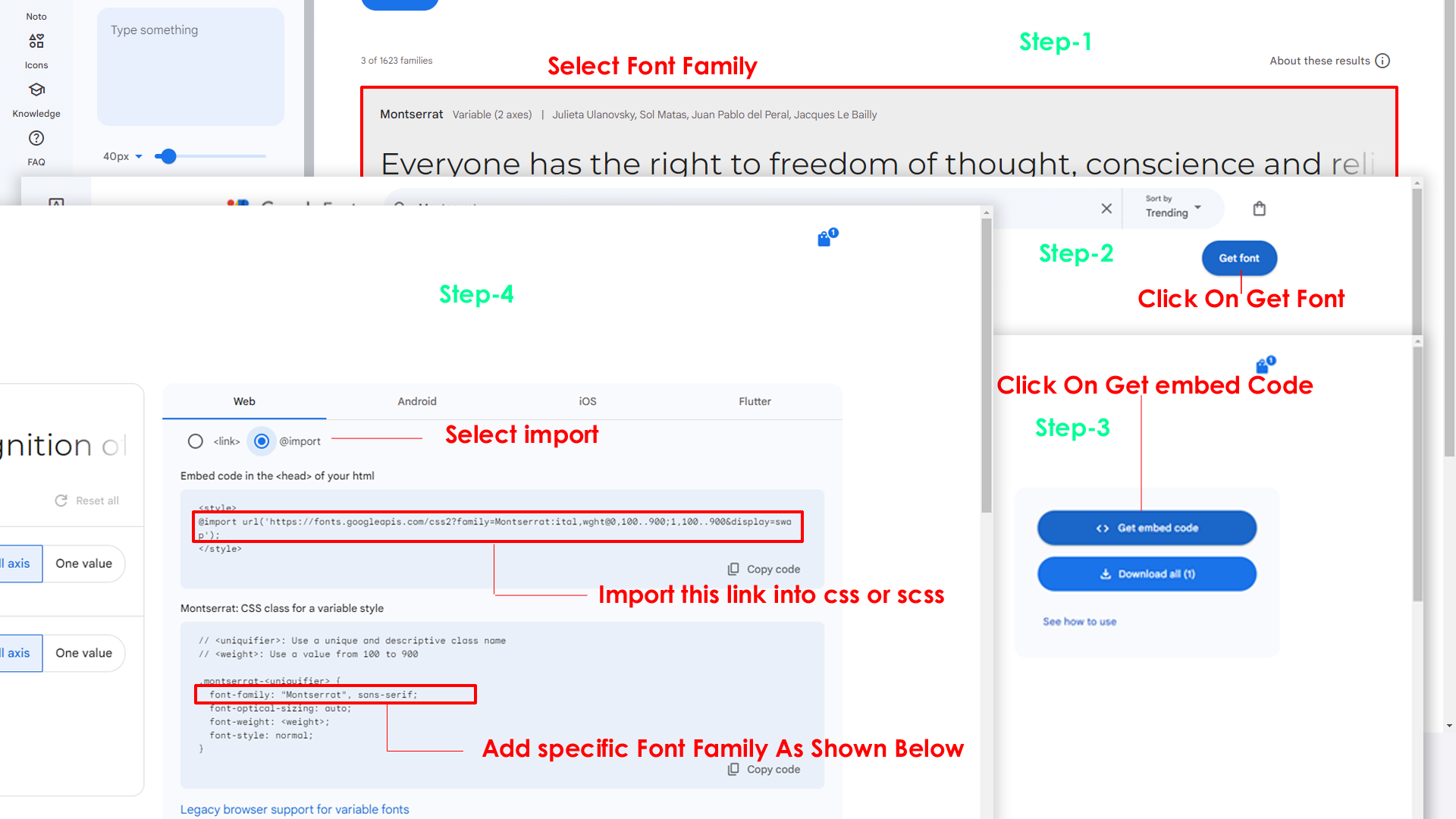
Step 2:
And paste Your Selected font-family in style.scss
Example:

Step 3:
And add the Your Selected font-family in _variables.scss(src/assets/scss/_variables.scss)
Example:
--default-font-family: "Montserrat", sans-serif;
By default menu icons are in the from remix icon if you want to change the icons please follow below steps
Step 1 :
To change Menu icons, open nav.jsx page
Path:src\components\sidebar\nav.jsx
and go through app-sidebar section, in that section
you will find
icontag, there you can replace previous icon
with your icon. Example as shown in below
Go To "public/assets/images/brand-logos" folder and replace your logo with Previous Logos within in image size. note: Please don't increase logo sizes. Replace your logo within given image size. otherwise the logo will not fit in particular place it disturbs the template design.
To change Layout Theme
open reducer.jsx
path:(\src\components\common\ui\redux\reducer.jsx).
Theme Array Documentation
The theme array provided below is designed to control the layout and styling of a web application. By modifying the values in this array, you can change the visual appearance and behavior of various components in the application. The array includes settings related to color schemes, layout styles, header and menu styles, and more.
Initial State
The initial state of the theme array defines the default values for different aspects of the application's appearance and behavior. These values are used as a starting point and can be dynamically modified using the provided functions.
            let initialState = {
                lang: "en",                 // Default language
                dir: "ltr",                 // Default text direction (ltr or rtl)
                    : "light",             // Default color scheme (light or dark)
                dataMenuStyles: "light",     // Default menu style (dark, light, color, gradient, transparent)
                dataNavLayout: "vertical",  // Default navigation layout (vertical or horizontal)
                dataHeaderStyles: "transparent",  // Default header style (light, dark, color, gradient, transparent)
                dataVerticalStyle: "overlay", // Default vertical menu style (overlay, icon-text, detached, doublemenu)
                toggled: "",          // Default menu toggle state (open or closed)
                dataNavStyle: "",           // Default navigation style (menu-click, menu-hover, icon-click, icon-hover)
                dataPageStyle: "regular",   // Default page style (regular or classic)
                dataWidth: "default",     // Default page width (fullwidth or boxed)
                dataMenuPosition: "fixed",  // Default menu position (fixed or scrollable)
                dataHeaderPosition: "fixed",// Default header position (fixed or scrollable)
                loader:"disable",            / Default loader (enable or disable)
                iconOverlay: "",            // Default icon overlay state (empty)
                colorPrimaryRgb: "",        // Default primary color (RGB format)
                colorPrimary: "",           // Default primary color (space-separated RGB values)
                bodyBg1: "",                 // Default body background color1 (empty)
                bodyBg2: "",                 // Default body background color2 (empty)
                Light: "",                 // Default body background color (empty)
                Formcontrol: "",                 // Default body background color (empty)
                inputBorder: "",             // Default dark inputBorder color (empty)
                Graycolor: "",                 // Default dark background color (empty)
                bgImg: "",                  // Default background image (empty)
                iconText: "",               // Default icon text style (empty)
                body: {
                    class: ""               // Default body class (empty)
                }
            };
Theme Modification Functions
to Change the Modification Functions open
switcherdata.jsx
path:(src\components\common\data\switcherdata\switcherdata.jsx).
The provided functions allow you to modify specific aspects of the theme array, enabling real-time customization of the application's appearance. Below are some of the key functions that can be used to change various theme properties:
Dark(actionfunction): Switches the theme to a dark color scheme. Updates class, header style, and menu style accordingly.Light(actionfunction): Switches the theme to a light color scheme. Adjusts header and menu styles based on the navigation layout.Ltr(actionfunction): Sets the text direction to left-to-right.Rtl(actionfunction): Sets the text direction to right-to-left.HorizontalClick(actionfunction): Changes the navigation layout to horizontal and adapts menu and vertical style based on the color scheme.Vertical(actionfunction): Sets the navigation layout to vertical, adjusts menu and vertical style, and closes the menu if open.Menuclick(actionfunction): Sets the navigation style to "menu-click," hides vertical style, and changes the toggle state.MenuHover(actionfunction): Sets the navigation style to "menu-hover," hides vertical style, and changes the toggle state.IconClick(actionfunction): Sets the navigation style to "icon-click," hides vertical style, and changes the toggle state.IconHover(actionfunction): Sets the navigation style to "icon-hover," hides vertical style, and changes the toggle state.Regular(actionfunction): Sets the page style to regular and removes the classic page style.Classic(actionfunction): Sets the page style to classic and removes the regular page style.Fullwidth(actionfunction): Sets the page width to full width and removes the boxed width.Boxed(actionfunction): Sets the page width to boxed and removes the full width.FixedMenu(actionfunction): Sets the menu position to fixed and removes the scrollable menu position.scrollMenu(actionfunction): Sets the menu position to scrollable and removes the fixed menu position.Headerpostionfixed(actionfunction): Sets the header position to fixed and removes the scrollable header position.Headerpostionscroll(actionfunction): Sets the header position to scrollable and removes the fixed header position.Defaultmenu(actionfunction): Sets the vertical menu style to default, closes the menu, and adjusts the navigation layout.Closedmenu(actionfunction): Sets the vertical menu style to closed, adjusts the navigation layout, and changes the toggle state.iconText(actionfunction): Sets the vertical menu style to icon-text, adjusts the navigation layout, and changes the toggle state.iconOverayFn(actionfunction): Sets the vertical menu style to overlay with icons, adjusts the navigation layout, and changes the toggle state.DetachedFn(actionfunction): Sets the vertical menu style to detached, adjusts the navigation layout, and changes the toggle state.DoubletFn(actionfunction): Sets the vertical menu style to double menu, adjusts the navigation layout, and changes the toggle state.colorMenu(actionfunction): Changes the menu style to color.lightMenu(actionfunction): Changes the menu style to light.darkMenu(actionfunction): Changes the menu style to dark.gradientMenu(actionfunction): Changes the menu style to gradient.transparentMenu(actionfunction): Changes the menu style to transparent.lightHeader(actionfunction): Changes the header style to light.darkHeader(actionfunction): Changes the header style to dark.colorHeader(actionfunction): Changes the header style to color.gradientHeader(actionfunction): Changes the header style to gradient.transparentHeader(actionfunction): Changes the header style to transparent.primaryColor1(actionfunction)toprimaryColor5(actionfunction): Changes the primary color of the theme.backgroundColor1(actionfunction)tobackgroundColor5(actionfunction): Changes the background color of the theme.Themeprimarycolor(actionfunction): Provides a color picker interface to dynamically change the primary color of the theme.Themebackgroundcolor(actionfunction): Provides a color picker interface to dynamically change the background color of the theme.bgImage1(actionfunction)tobgImage5(actionfunction): Changes the background image of the theme.Reset(actionfunction): Resets the theme to its initial state, clearing all customization.
Disabling Switcher
Step1:
Open header.jsx component
src\components\header\header.jsx
To remove switcher section as shown below.
            <Link href="#!" scroll={false} className="header-link switcher-icon" data-bs-toggle="offcanvas" data-bs-target="#switcher-canvas" onClick={() => Switchericon()}>
            <svg xmlns="http://www.w3.org/2000/svg" className="w-6 h-6 header-link-icon" fill="none" viewBox="0 0 24 24" strokeWidth="1.5" stroke="currentColor">
            <path strokeLinecap="round" strokeLinejoin="round" d="M9.594 3.94c.09-.542.56-.94 1.11-.94h2.593c.55 0 1.02.398 1.11.94l.213 1.281c.063.374.313.686.645.87.074.04.147.083.22.127.325.196.72.257 1.075.124l1.217-.456a1.125 1.125 0 0 1 1.37.49l1.296 2.247a1.125 1.125 0 0 1-.26 1.431l-1.003.827c-.293.241-.438.613-.43.992a7.723 7.723 0 0 1 0 .255c-.008.378.137.75.43.991l1.004.827c.424.35.534.955.26 1.43l-1.298 2.247a1.125 1.125 0 0 1-1.369.491l-1.217-.456c-.355-.133-.75-.072-1.076.124a6.47 6.47 0 0 1-.22.128c-.331.183-.581.495-.644.869l-.213 1.281c-.09.543-.56.94-1.11.94h-2.594c-.55 0-1.019-.398-1.11-.94l-.213-1.281c-.062-.374-.312-.686-.644-.87a6.52 6.52 0 0 1-.22-.127c-.325-.196-.72-.257-1.076-.124l-1.217.456a1.125 1.125 0 0 1-1.369-.49l-1.297-2.247a1.125 1.125 0 0 1 .26-1.431l1.004-.827c.292-.24.437-.613.43-.991a6.932 6.932 0 0 1 0-.255c.007-.38-.138-.751-.43-.992l-1.004-.827a1.125 1.125 0 0 1-.26-1.43l1.297-2.247a1.125 1.125 0 0 1 1.37-.491l1.216.456c.356.133.751.072 1.076-.124.072-.044.146-.086.22-.128.332-.183.582-.495.644-.869l.214-1.28Z" />
            <path strokeLinecap="round" strokeLinejoin="round" d="M15 12a3 3 0 1 1-6 0 3 3 0 0 1 6 0Z" />
            </svg>
            </Link>
Step2:
Remove the switcher component from the
main layout follow the path
Path: app\(components)\(content-layout)\layout.jsx
import Switcher from "../components/switcher/switcher"

        <Switcher />
Step3:
Now remove the switcher component and switcherData file
from the root folder, follow the path
Switcher component src\components\switcher\switcher.jsx
and
switcherdata file from src\components\common\data\switcherdata\switcherdata.jsx
Step1:
Open layout.jsx component
\apps/components/authentication-layout/layout.jsx
To remove switcher section as shown below.
 import Switcher from "../components/switcher/switcher"

        <Switcher />
Step2:
Remove theLandingSwitcher component from the
main layout follow the path
\app\(components)\(landing-layout)\layout.jsx
import LandingSwitcher from '../components/switcher/landing-switcher';

                <Landingswitcher />
Step3:
Now remove the landingswitcher component from the root
folder, follow the path
\src\components\switcher\landing-switcher.jsx
and
Refer following links for usage:
| Icons | References |
|---|---|
| Bootstrap Icons | https://icons.getbootstrap.com/ |
| Boxicons | https://boxicons.com/ |
| Remix Icons | https://remixicon.com/ |
| Feather Icons | https://feathericons.com/ |
| Tabler Icons | https://tabler-icons.io/ |
| Line Awesome Icons | https://icons8.com/line-awesome |
| Heroicons | https://heroicons.com/ |
Refer following links for usage:
| Images | References |
|---|---|
| Vecteezy | https://www.vecteezy.com/ |
| Iconscout | https://iconscout.com/ |
| Unsplash | https://unsplash.com/ |
| Png Tree | https://pngtree.com/ |
| flaticon | https://www.flaticon.com/authors/flat-icons |
| freepik | https://www.freepik.com |
Refer following links for usage:
| Google Fonts | https://fonts.google.com/ |
Refer following links for usage:
| Heroicons | https://heroicons.com/ |
All plugins runs through npm.
If you want new plugins : Install new plugin from npm then run
npm run dev command.
Introduction of React-Redux
Redux is a predictable state container designed to help you write JavaScript
apps that behave consistently across client, server, and native
environments,
and are easy to test. While it's mostly used as a state management tool with
React, you can use it with any other JavaScript framework or library.
if you are using Redux with any kind of UI framework, you will normally use
a
"UI binding" library to tie Redux together with your UI framework, rather
than
directly interacting with the store from your UI code.
For better understanding Redux we suggest you once go through official
documentation of Redux from Redux
Documentation
Getting Started
Setting up the redux environment to workspace
This guide explains how to set up your environment for react development using the React-redux tool. It includes information about process of installing, creating an dynamic workspace or a e-commerce web Application.
Redux Setup
Create a dynamic workspace or a E-commerce web application
You need to have those package, just follow the below steps
- Run the command , as shown below
- This new command prompts for the information about installs the necessary redux packages and other dependencies. This can take a few minutes.
First step :
npm install redux redux-devtools-extension redux-thunk
Second step:
create three indivisual js files in your workspace such as : "Action","Reducer","Store"
Action is use for, create a action for indivisual functionality, which wil return the action type, and if action contains the payload, and also it returns the payload.
Reduce is use for, to creating the action functionality and it is always wait for the action type and the reducer we will import in the redux-store file.
Store is the middleware of connecting the components to redux. we will
import the store in the main layout file(App.jsx),
which will wrap
the store in the react-redux provider just like;
<Provider store={store}></Provider>.1. You need to add these files to make it work.
| Type | URL |
|---|---|
| Plugin Link | https://swiperjs.com/get-started/ |
1. You need to add these files to make react-apexchart work.
| Type | URL |
|---|---|
| Plugin Link | https://apexcharts.com/react-chart-demos/ |
1. You need to add these files to make basic react-suneditor work.
| Type | URL |
|---|---|
| Plugin Link | https://www.npmjs.com/package/suneditor-react |
1. You need to add these files to make basic react-flatpicker work.
| Type | URL |
|---|---|
| Plugin Link | https://www.npmjs.com/package/react-flatpickr |
1. You need to add these files to make basic react-select work.
| Type | URL |
|---|---|
| Plugin Link | https://www.npmjs.com/package/react-select |
1. You need to add below files to make basic gridjs table work.
| Type | URL |
|---|---|
| Plugin Link | https://www.npmjs.com/package/gridjs-react |
1. You need to add these files to make basic default table work.
1. You need to add these files to make React data-table work.
| Type | URL |
|---|---|
| Plugin Link | https://www.npmjs.com/package/react-table |
1. You need to add these files to make react toastify work.
| Type | URL |
|---|---|
| Plugin Link | https://www.npmjs.com/package/react-toastify |
1. You need to add these files to make react rating work.
| Type | URL |
|---|---|
| Plugin Link | https://mui.com/material-ui/react-rating/ |
1. You need to add these files to make alerts work.
1. You need to add these files to make buttons work.
1. You need to add these files to make badges work.
1. You need to add these files to make button group work.
1. You need to add these files to make cards work.
1. You need to add these files to make breadcrumb work.
1. You need to add these files to make dropdown work.
1. You need to add these files to make tooltipss work.
1. You need to add these files to make yaireo/dragsort work.
1. You need to add these files to make Progress work.
1. You need to add these files to make List Group work.
1. You need to add these files to make toast work.
1. You need to add these files to make accordions work.
1. You need to add these files to make carousel work.
Please follow the below steps to change Primary Color
Step 1 :
To change Primary Color you have to open _variables.scss file and replace what color you want as shown in below
Rootpath : _variables.scss (public/assets/scss/_variables.scss )
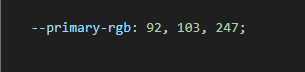
npm run sass command.Please follow the below steps to change Dark body Color
Step 1 :
Make sure the theme is set completely to dark mode by adding the following attributes to the html tag data-theme-mode="dark" data-header-styles="dark" data-menu-styles="dark"
Step 2 :
To change Dark body Color you have to open _variables.scss file and replace what color you want as shown in below
Rootpath : _variables.scss (public/assets/scss/_variables.scss )
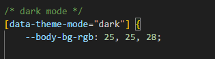
Step 3 :
Also Change the following variable colors to the desired theme background accordingly in [data-theme-mode="dark"]
--light-rgb : --form-control-bg : --body-bg-rgb2 : --input-border : --gray-3 :npm run sass command.