FAQS
General Style
How to Change Font Family ?
Step 1:
Go To style.scss (src/assets/scss/styles.scss )
if you want to change another font-family Go to the site Google Fonts And Select One font Family and import in to styles.scss file
How to Select font Family
Example:
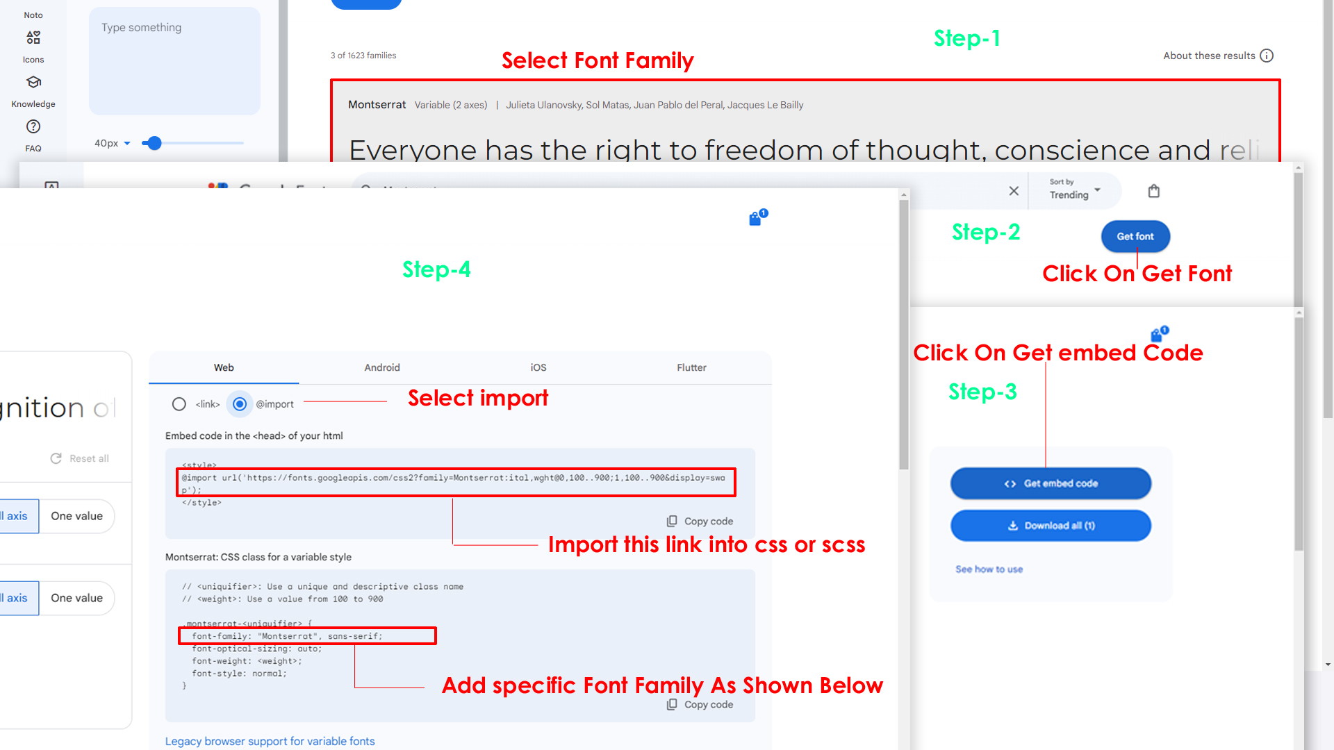
Step 2:
And paste Your Selected font-family in style.scss
Example:

Step 3:
And add the Your Selected font-family in _variables.scss(src/assets/scss/_variables.scss)
Example:
--default-font-family: 'Inter', sans-serif;
How to change Menu icons ?
By default menu icons are Bootstrap icons, if you
want to change icons please follow below steps
Step 1 :
To change Menu icons, open Sidemenudata.jsx page Path: src\pages\common\arreydata\Sidemenudata.jsx and go through
Common
section, in that section you will find bi icon class in the parent objects, there you can replace previous icon class with your icon. Example
as shown in below
Step 2 :
next step, open Sidebar.jsx as well as Menuloop.jsx components Path: { src\pages\layout\layoutpages\Sidebar.jsx } and { src\pages\layout\layoutpages\Menuloop.jsx } and go through
loop content
section, in that section you will find icon loops alligned with i tag {<i className=""> </i>} , there you can replace previous icon class with your icon. Example
as shown in below
How to Change Logo ?
Go To "src/assets/images/brand" folder and replace your logo with Previous Logos within in image size. note: Please don't increase logo sizes. Replace your logo within given image size. otherwise the logo will not fit in particular place it disturbs the template design.
How to Change the Layout Theme ?
open reducer.jsx path:(src\pages\common\redux\Reducer.jsx).
Theme Array Documentation
The theme array provided below is designed to control the layout and styling of a web application. By modifying the values in this array, you can change the visual appearance and behavior of various components in the application. The array includes settings related to color schemes, layout styles, header and menu styles, and more.
Initial State
The initial state of the theme array defines the default values for different aspects of the application's appearance and behavior. These values are used as a starting point and can be dynamically modified using the provided functions.
let initialState = {
lang: "en",                 // Default language
dir: "ltr",                 // Default text direction (ltr or rtl)
class: "light",             // Default color scheme (light or dark)
dataMenuStyles: "dark",     // Default menu style (dark, light, color, gradient, transparent)
dataNavLayout: "vertical",  // Default navigation layout (vertical or horizontal)
dataHeaderStyles: "light",  // Default header style (light, dark, color, gradient, transparent)
dataVerticalStyle: "overlay", // Default vertical menu style (overlay, icon-text, detached, doublemenu)
StylebodyBg: "107 64 64",   // Default body background color (RGB format)
StyleDarkBg: "93 50 50",    // Default dark background color (RGB format)
toggled: "",          // Default menu toggle state (open or closed)
dataNavStyle: "",           // Default navigation style (menu-click, menu-hover, icon-click, icon-hover)
horStyle: "",               // Default horizontal navigation style (empty)
dataPageStyle: "regular",   // Default page style (regular or classic)
dataWidth: "fullwidth",     // Default page width (fullwidth or boxed)
dataMenuPosition: "fixed",  // Default menu position (fixed or scrollable)
dataHeaderPosition: "fixed",// Default header position (fixed or scrollable)
loader:"disable",            / Default loader (enable or disable)
iconOverlay: "",            // Default icon overlay state (empty)
colorPrimaryRgb: "",        // Default primary color (RGB format)
colorPrimary: "",           // Default primary color (space-separated RGB values)
bodyBg1: "",                 // Default body background color (empty)
bodyBg2: "",                 // Default body background color (empty)
darkBg: "",                 // Default dark background color (empty)
inputBorder: "",             // Default dark inputBorder color (empty)
bgImg: "",                  // Default background image (empty)
iconText: "",               // Default icon text style (empty)
body: {
class: ""               // Default body class (empty)
}
};
Theme Modification Functions
to Change the Modification Functions open switcherdata.jsx path:(Root: src\pages\common\Switcherdata.jsx).
The provided functions allow you to modify specific aspects of the theme array, enabling real-time customization of the application's appearance. Below are some of the key functions that can be used to change various theme properties:
Dark(actionfunction): Switches the theme to a dark color scheme. Updates class, header style, and menu style accordingly.Light(actionfunction): Switches the theme to a light color scheme. Adjusts header and menu styles based on the navigation layout.Ltr(actionfunction): Sets the text direction to left-to-right.Rtl(actionfunction): Sets the text direction to right-to-left.HorizontalClick(actionfunction): Changes the navigation layout to horizontal and adapts menu and vertical style based on the color scheme.Vertical(actionfunction): Sets the navigation layout to vertical, adjusts menu and vertical style, and closes the menu if open.Menuclick(actionfunction): Sets the navigation style to "menu-click," hides vertical style, and changes the toggle state.MenuHover(actionfunction): Sets the navigation style to "menu-hover," hides vertical style, and changes the toggle state.IconClick(actionfunction): Sets the navigation style to "icon-click," hides vertical style, and changes the toggle state.IconHover(actionfunction): Sets the navigation style to "icon-hover," hides vertical style, and changes the toggle state.Regular(actionfunction): Sets the page style to regular and removes the classic page style.Classic(actionfunction): Sets the page style to classic and removes the regular page style.Fullwidth(actionfunction): Sets the page width to full width and removes the boxed width.Boxed(actionfunction): Sets the page width to boxed and removes the full width.FixedMenu(actionfunction): Sets the menu position to fixed and removes the scrollable menu position.scrollMenu(actionfunction): Sets the menu position to scrollable and removes the fixed menu position.Headerpostionfixed(actionfunction): Sets the header position to fixed and removes the scrollable header position.Headerpostionscroll(actionfunction): Sets the header position to scrollable and removes the fixed header position.Defaultmenu(actionfunction): Sets the vertical menu style to default, closes the menu, and adjusts the navigation layout.Closedmenu(actionfunction): Sets the vertical menu style to closed, adjusts the navigation layout, and changes the toggle state.iconText(actionfunction): Sets the vertical menu style to icon-text, adjusts the navigation layout, and changes the toggle state.iconOverayFn(actionfunction): Sets the vertical menu style to overlay with icons, adjusts the navigation layout, and changes the toggle state.DetachedFn(actionfunction): Sets the vertical menu style to detached, adjusts the navigation layout, and changes the toggle state.DoubletFn(actionfunction): Sets the vertical menu style to double menu, adjusts the navigation layout, and changes the toggle state.colorMenu(actionfunction): Changes the menu style to color.lightMenu(actionfunction): Changes the menu style to light.darkMenu(actionfunction): Changes the menu style to dark.gradientMenu(actionfunction): Changes the menu style to gradient.transparentMenu(actionfunction): Changes the menu style to transparent.lightHeader(actionfunction): Changes the header style to light.darkHeader(actionfunction): Changes the header style to dark.colorHeader(actionfunction): Changes the header style to color.gradientHeader(actionfunction): Changes the header style to gradient.transparentHeader(actionfunction): Changes the header style to transparent.primaryColor1(actionfunction)toprimaryColor5(actionfunction): Changes the primary color of the theme.backgroundColor1(actionfunction)tobackgroundColor5(actionfunction): Changes the background color of the theme.Themeprimarycolor(actionfunction): Provides a color picker interface to dynamically change the primary color of the theme.Themebackgroundcolor(actionfunction): Provides a color picker interface to dynamically change the background color of the theme.bgImage1(actionfunction)tobgImage5(actionfunction): Changes the background image of the theme.Reset(actionfunction): Resets the theme to its initial state, clearing all customization.
Details discussion about "react-helmet-async", how to set up the react environment with this package ?
This library proves particularly beneficial in scenarios where developers need to dynamically modify meta-information such as titles, meta tags, styles, and scripts in response to changes in the application's state or props. By leveraging the asynchronous API provided by react-helmet-async, developers can achieve this functionality while mitigating potential performance bottlenecks associated with synchronous operations on the main thread.
Noteworthy features of react-helmet-async include its seamless integration with server-side rendering (SSR), ensuring that head tags are appropriately configured during the server-rendering process. Despite its advanced capabilities, the library remains straightforward to use, offering a declarative API reminiscent of the original react-helmet.
To illustrate its usage, consider the following example in the vexel Javascript React component
Install the following packages "react-helmet-async" && "react-helmet".
Within your routing file, it is advisable to include the "HelmetProvider" to facilitate global access to it across all components. Integrating the "HelmetProvider" at this level ensures that the document head can be managed uniformly throughout the application, enabling the seamless configuration of meta tags, titles, and other head elements in each component.
import React, { Fragment } from 'react';
import ReactDOM from 'react-dom/client';
import { BrowserRouter, Route, Routes } from 'react-router-dom';
import { HelmetProvider } from 'react-helmet-async';

ReactDOM.createRoot(document.getElementById('root')!).render(
<Fragment>
<HelmetProvider>
<BrowserRouter>

<Routes>
<Route>
</Route>

{/* //main layout */}

<Route path={`${import.meta.env.BASE_URL}`} element={<App />}>
<Route index element={<Indexpage />} />
{RouteData.map((idx) => (
<Route key={key={idx.id}} path={idx.path} element={idx.element} />
))}
</Route>

</Routes>

</BrowserRouter>
</HelmetProvider>
</Fragment>
);
open mainlayout component App.jsx path:(src\layouts\App.jsx).
import { FC, Fragment } from 'react';
import { Provider } from 'react-redux';
import store from '../common/redux/Store';
import { Outlet } from 'react-router-dom';
import { Helmet } from 'react-helmet-async';

interface ComponentProps { }

const App: FC<ComponentProps> = () => {

return (
<Fragment>
<Helmet
htmlAttributes={{ lang: "en", dir:"ltr",
                  "data-nav-layout": "vertical","data-theme-mode": "light",
				  "data-header-styles": "light","data-menu-styles": "dark",
				  "data-page-style": "","data-width": "","data-menu-position":"",
				  "data-header-position": ""
}}><body className="app sidebar-mini ltr" /></Helmet>
<Provider store={store}>
<Switcher />
<div className='page'>
<div className="page-main">
<Header />
<Sidebar />
<div className="main-content app-content mt-0">
<Outlet />
</div>
</div>
<Footer />
</div>
<Backtotop />
</Provider>
</Fragment>
);
};

export default App;
Disabling Switcher
How To Disable Switcher In All Pages ?
Step1:
Open Header.jsx component src\pages\layout\layoutpages\Header.jsx
To remove switcher section as shown below.
	//Switcher functionality

	const [showSwitcher, setShowSwitcher] = useState(false);

	const handleSwitcherClick = () => {
		setShowSwitcher(true);
	};


	<li className="header-element">

		<Link to="#" className="header-link switcher-icon" onClick={handleSwitcherClick}>
			<i className="bi bi-gear header-link-icon border-0">
		</Link>

		<Switcher show={showSwitcher} onClose={() => setShowSwitcher(false)} />
	</li>
Step2:
Now remove the switcher component and switcherData file from the root folder, follow the path Switcher component src\pages\layout\layoutpages\Switcher.jsx and
remove the Switchdata component from file path (src\pages\common\Switcherdata.jsx)
Step3:
Open main.jsx component src\main.jsx
Need to Add the store for the App component in main.jsx.
 //Before code of App Route Start

	<Route path={`${import.meta.env.BASE_URL}`} element={<App />}>
		{RouteData.map((idx) => (
			<Route key={idx.id} path={idx.path} element={idx.element} />
		))}
	</Route>
 //Before code of App Route End

 //Updated code of App Route Start

 //import  paths are
import { Provider } from 'react-redux';
import store from './pages/common/redux/Store.jsx';

<Route path={`${import.meta.env.BASE_URL}`} element={
	<Provider store={store}>
		<App />
	</Provider>}>
	{RouteData.map((idx) => (
	  <Route key={idx.id} path={idx.path} element={idx.element} />
	))}
</Route>

 //Updated code of App Route End
Step4:
Open app.jsx component src\pages\layout\app.jsx
Replace the complete App.jsx.
 // App  Start
 import { Fragment } from 'react';
 import { Helmet, HelmetProvider } from 'react-helmet-async';
 import { Provider } from 'react-redux';
 import ScrollTop from './layoutpages/ScrollTop';
 import { Outlet } from 'react-router-dom';
 import Header from './layoutpages/Header';
 import Sidebar from './layoutpages/Sidebar';
 import Footer from './layoutpages/Footer';
 import store from '../common/redux/Store';
 import { connect } from 'react-redux';
 import { ThemeChanger } from '../common/redux/Action';


 const App = ({local_varaiable}) => {

   const generateCustomStyles = () => {
	 let styles = '';

	 if (localStorage.getItem("darkBgRGB1") && localStorage.getItem("darkBgRGB2")) {
	   styles += `--body-bg-rgb:${local_varaiable.bodybg};`;
	   styles += `--body-bg-rgb2:${local_varaiable.darkbg};`;
	   styles += `--light-rgb:${local_varaiable.darkbg};`;
	   styles += `--form-control-bg:rgb(${local_varaiable.darkbg});`;
	   styles += `--input-border:rgba(${local_varaiable.inputBorder});`;
	 }

	 if (localStorage.getItem("primaryRGB")) {
	   styles += `--primary-rgb:${local_varaiable.colorprimaryrgb};`;
	 }

	 return styles;
   };
   const customStyles = generateCustomStyles();
   return (
	 <Fragment>
	   <Provider store={store}>
	   <HelmetProvider>
		 <Helmet>
		   <html dir={local_varaiable.dir}
			 data-theme-mode={local_varaiable.datathememode}
			 data-header-styles={local_varaiable.dataheaderstyles}
			 data-vertical-style={local_varaiable.dataverticalstyle}
			 data-nav-layout={local_varaiable.datanavlayout}
			 data-menu-styles={local_varaiable.datamenustyles}
			 data-toggled={local_varaiable.toggled}
			 data-nav-style={local_varaiable.datanavstyle}
			 hor-style={local_varaiable.horstyle}
			 data-page-style={local_varaiable.datapagestyle}
			 data-width={local_varaiable.datawidth}
			 data-menu-position={local_varaiable.datamenuposition}
			 data-header-position={local_varaiable.dataheaderposition}
			 data-icon-overlay={local_varaiable.iconoverlay}
			 data-bg-img={local_varaiable.bgimg}
			 data-icon-text={local_varaiable.icontext}
			 style={customStyles}
		   >
		   </html>
			 <body className=''></body>
		   </Helmet>
		 </HelmetProvider>
		 <div className="page">
		   <Header />
		   <Sidebar />
		   <div className="main-content app-content">
			 <div className="container-fluid">
			   <Outlet />
			 </div>
		   </div>
		   <Footer />
		 </div>
	   </Provider>

	   <ScrollTop />
	   <div id="responsive-overlay"></div>
	 </Fragment>
   );
 };