FAQS
General Style
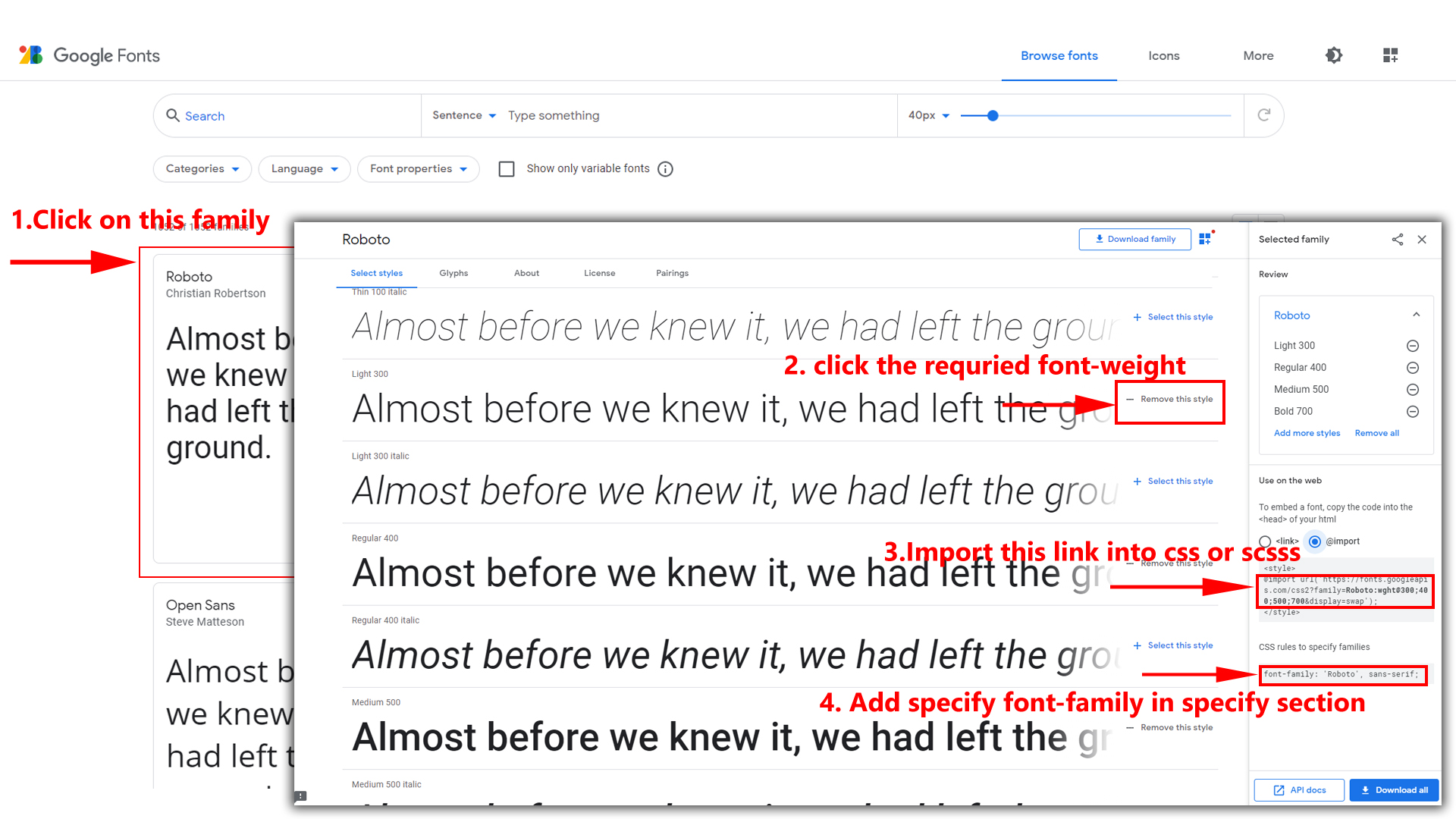
How to Change Font Style ?
Step 1:
Go To style.scss (src/assets/scss/styles.scss )
if you want to change another font-family Go to the site Google Fonts And Select One font Family and import in to styles.scss file
How to Select font Family
Example:
Step 2:
And paste Your Selected font-family in style.scss
Example:

Step 3:
And add the Your Selected font-family in tailwind config file inplace of old font
Example:
fontFamily: {
	inter: ["Inter", "sans-serif"], //place your font here
},
Step 4:
And add the Your Selected font-family to body that is font-inter in custom.scss file (rootpath :- assets/scss/tailwind/_custom.scss) file inplace of old font
Example:
body {
 @apply bg-bodybg h-full text-gray-600 dark:text-white m-0 font-inter font-normal text-sm relative;
}
How to change Menu icons ?
By default menu icons are in the from remix icon if you want to change the icons please follow below steps
Step 1 :
To change Menu icons, open sidebar.html page
Path:src\components\common\sidebar\nav.tsx and go through app-sidebar section, in that section you will find
icontag, there you can replace previous icon with your icon. Example as shown in below
How to Change Logo ?
Go To "src/assets/img/brand-logos" folder and replace your logo with Previous Logos within in image size. note: Please don't increase logo sizes. Replace your logo within given image size. otherwise the logo will not fit in particular place it disturbs the template design.
To change Layout Theme
How to Change the Layout Theme ?
open reducer.tsx
path:(\src\redux\reducer.tsx).
Theme Array Documentation
The theme array provided below is designed to control the layout and styling of a web application. By modifying the values in this array, you can change the visual appearance and behavior of various components in the application. The array includes settings related to color schemes, layout styles, header and menu styles, and more.
Initial State
The initial state of the theme array defines the default values for different aspects of the application's appearance and behavior. These values are used as a starting point and can be dynamically modified using the provided functions.
		let initialState = {
			lang: "en",                 // Default language
			dir: "ltr",                 // Default text direction (ltr or rtl)
			class: "light",             // Default color scheme (light or dark)
			dataMenuStyles: "light",     // Default menu style (dark, light, color, gradient, transparent)
			dataNavLayout: "vertical",  // Default navigation layout (vertical or horizontal)
			dataHeaderStyles: "transparent",  // Default header style (light, dark, color, gradient, transparent)
			dataVerticalStyle: "overlay", // Default vertical menu style (overlay, icon-text, detached, doublemenu)
			dataToggled: "",          // Default menu toggle state (open or closed)
			dataNavStyle: "",           // Default navigation style (menu-click, menu-hover, icon-click, icon-hover)
			dataPageStyle: "regular",   // Default page style (regular or classic)
			dataWidth: "default",     // Default page width (fullwidth or boxed)
			dataMenuPosition: "fixed",  // Default menu position (fixed or scrollable)
			dataHeaderPosition: "fixed",// Default header position (fixed or scrollable)
			loader:"disable",            / Default loader (enable or disable)
			iconOverlay: "",            // Default icon overlay state (empty)
			colorPrimaryRgb: "",        // Default primary color (RGB format)
			colorPrimary: "",           // Default primary color (space-separated RGB values)
			bodyBg: "",                 // Default body background color1 (empty)
			Light: "",                 // Default body background color (empty)
			darkBg: "",                 // Default body background color2 (empty)
			inputBorder: "",             // Default dark inputBorder color (empty)
			bgImg: "",                  // Default background image (empty)
			iconText: "",               // Default icon text style (empty)
			body: {
				class: ""               // Default body class (empty)
			}
			ecommercedata : [
	{
	//products
	},
}
Theme Modification Functions
to Change the Modification Functions open
switcherdata.tsx
path:(src\components\ui\data\switcherdata\switcherdata.tsx).
The provided functions allow you to modify specific aspects of the theme array, enabling real-time customization of the application's appearance. Below are some of the key functions that can be used to change various theme properties:
Disabling Switcher
How To Disable Switcher In All Pages ?
Step1:
Open header.tsx component src\components\common\header\header.tsx
To remove switcher section as shown below.
<SpkButton Label="button" buttontype="button"
customClass="hs-dropdown-toggle switcher-icon inline-flex flex-shrink-0 justify-center items-center gap-2  rounded-full font-medium  align-middle transition-all text-xs dark:text-[#8c9097] dark:text-white/50 dark:hover:text-white dark:focus:ring-white/10 dark:focus:ring-offset-white/10"
 Overlay="#hs-overlay-switcher">
<i className="bx bx-cog header-link-icon animate-spin-slow"></i>
</SpkButton>
Step2:
Remove theSwitcher component from the main layout follow the path src\pages\App.tsx
import Switcher from "../components/common/switcher/switcher";

<Switcher />
Step3:
Now remove the switcher component and switcherData file from the root folder, follow the path Switcher component src\components\common\switcher and src\components\ui\data\switcherdata\switcherdata.tsx
How To Remove Switcher In Landing Page ?
Step1:
Open landing.tsx component src\container\pages\landing\landing.tsx
To remove switcher section as shown below.
<Link aria-label="anchor" to="#"  className="ti-btn m-0 p-2 px-3 ti-btn-light !font-medium"
data-hs-overlay="#hs-overlay-switcher"> <i className="ri-settings-3-line animate-spin-slow"> </i> </Link>
Step2:
Remove theLandingSwitcher component from the main layout follow the path src\pages\landinglayout.tsx
import Landingswitcher from '../components/common/switcher/landingswitcher';

<Landingswitcher />
Step3:
Now remove the landingswitcher component from the root folder, follow the path src\components\common\switcher\landingswitcher.tsx and src\components\ui\data\switcherdata\landingswitcherdata.tsx